
Novartis | Global Risk Management
Helping to mitigate a $1.3 billion risk profile with a breakthrough platform

Role
Product Design Lead
Engagement Lead
Team
Scope
Project Management
Product Management
UI/UX Design
User Research
Prototyping
User Testing
Components
Context & Problem
Annually Novartis mitigates against circa $1.3billion of risk. In 2020 alone they were fined exactly this much for kickbacks, price fixing and bribery. Aiming to advance the ethical standards of the business, one solution was to improve how they identified and subsequently mitigated risky activities.
Whilst there was a broad guide of how to test activities for risk, it was left up to each of the global 71 RAM (Risk Assessment Management) Units on how they went about it. This led to testing being done in a time intensive way, manually in Excel with varying documents being created across the units, and no central records of the testing process.
The original brief
A RAM Unit had created a new Excel Testing Template and the idea was to create a digital version of this, with activities being referenced in from existing databases.
The aim, to have one universal process, to reduce manual input errors, reduce time and money spent, have centralised records - and ultimately be better able to identify risks.
Oh - and we had 2 months till we had to launch for the beginning of the testing cycle.

The proposed Excel Testing Template
Challenging the brief
After reviewing the proposed Testing Template the brief felt like an oversimplification for a process and tool that was going to serve the business and users globally. Beyond the limitations of simply creating a digital copy of the Excel, would this approach solve real user needs as well as the business'? Were there any other opportunities to take advantage of?
I decided we needed to validate these assumptions by interviewing a diverse set of potential users and business unit heads.
Initial user interview insights

From the initial insights I defined 3 key opportunity areas to design to, alongside getting buy-in & agreement to not replicate the Excel 1:1.

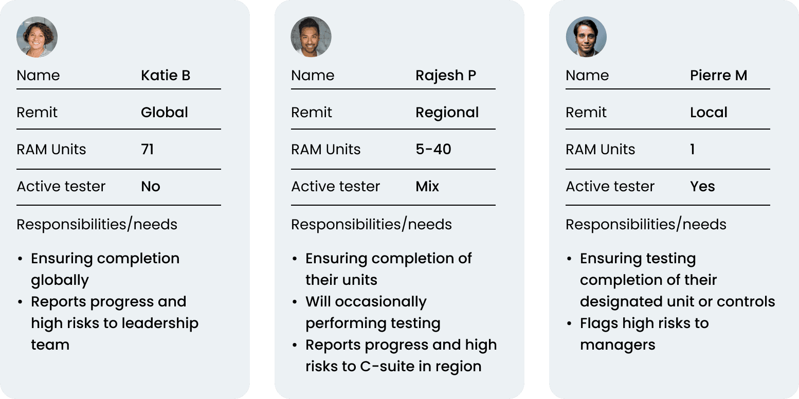
Using proto-personas to make progress
The team had a relatively low UX maturity and therefore didn’t have personas. To enable us to make progress at speed given the aggressive time-line I created proto-personas based on the user interviews + with support of the core working group. The key details to make progress being how many RAM Units needed to be visible and if they actively tested or not.
Creating a linear testing journey
The testing flow was the most important feature to develop for first release - as the progress metrics and reporting would be gain more significance further into the cycle.
To effectively understand the testing process itself I began by mapping out crude user journeys in Miro and onto Figma. I tested these with the core project team to reveal gaps in my knowledge of the process, data requirements and challenge them on existing taxonomies.
These low-fidelity mockups proved to be the most effective way to communicate over more abstract user-journeys.

Low + mid fidelity mockups
"We have to test with users to de-risk"
I probably sounded like a bit a stuck record at points but I was insistent with the core team that we had to test with a wider user base to de-risk the product before we were too far into design/development. Amongst others, qualitative testing with a cross-section of stakeholders from our global user base identified the need for:
- Custom questions per control
- To record multiple deficiencies per sample
- The minimum data requirements needed for the reporting capabilities planned
A defined testing journey
The outcome of this continuous discovery was a defined linear process with 4 repeating steps (dependent on user testing responsibilities).

Top-line user journey
Compromising on automated samples
Working with the engineers on the requirements for referencing in automated samples (and selecting X no. to suggest to test) it became apparent there would need to be a significant data mapping exercise to be able to reference all samples. The 8 different databases being drawn from had inconsistent naming conventions etc.
We decided that given the 2 month time frame we were working within to first release, the development cost of the data mapping would block the development of more important features.
We compromised for first release to require users to manually input sample information - this allowed us as the core team to define what the nomenclature and minimum requirements were for recording samples, which could be the basis for data mapping in the future.

The wider solution
Components that could shift, grow or stack
To accommodate the flexibility needed with large ranges in user permissions, eg. the range of 'Controls' visible to a user varied from 1 to 923+, it was important to create components that could scale to different needs.

Steps made clear to the user
Within the sample testing, it was important to define clear steps the user had to go through when answering questions related to the control. Conditional question sections could be added depending on the Activity Type of a sample - such as 'Membership' seen below.

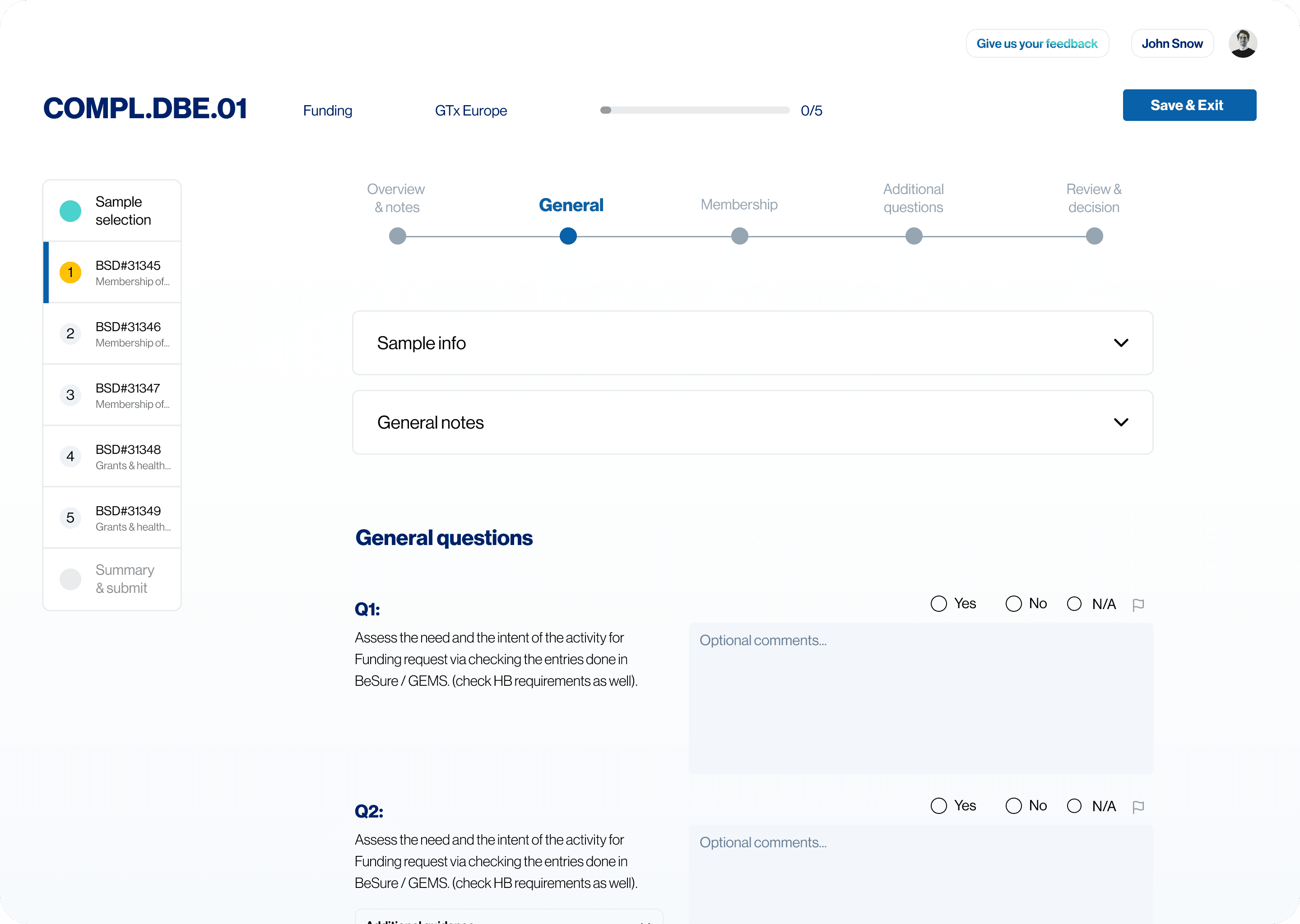
An overview of the screens created
With over 100+ screens being designed I haven't included them all here but please see a selection below.
The process to create the data-viz reports section is worthy of a case-study within itself so if you're interested please get in touch.


Identifying a moment of delight
Whether you're designing a process to assess risk, a payment flow or helping someone learn a new language - there are always opportunities to create moments of delight.
Putting myself into a risk managers' shoes I thought what an anticlimax it would be to end a 6 month testing cycle and simply getting a "Submitted, confirmed" and re-directed to home.
Legally was this celebration screen a requirement, no - but it helps to re-enforce that the action just taken is one of significance, one that mattered.
Oh, and let's be honest, it's fun.

Successes
A initial release allowed Units to begin testing using the Testing Tab, a subsequent release pushed the home tab, with progress tracking metrics and the reports tab with custom data-viz reports.
Across the project I consider the successes to be:
Alignment across Units on a singular testing process, including nomenclature and taxonomy
Central tracking for the first time, allowing visibility of progress at all levels
Comprehensive reporting capabilities
150+ users trained
Teaching & up-skilling the core team on user-centric methodologies