UBS | North America
Creating a holistic view of Wealth for ultra-high net worth individuals
Team
Cross functional team (20+ people)
2x Design Squads
Scope
UI/UX Design
User interviews + testing
A/B Testing
Updating brand identity
Stakeholder demos
Atomic Design system
The problem
Ultra-high-net-worth individuals (UHNWIs) need flexible daily financial management beyond just investments.
UBS historically lacked retail banking, preventing clients from viewing their finances holistically within its ecosystem. This caused attrition to competitors and third-party tools whilst also reducing UBS’s ability to sell investment products.
The goal
To design a new proposition introducing 'spaces', a converged banking and wealth experience - specifically catering for UHNWI. To reduce attrition rates and allow UBS to cross-sell products.
Spaces would reflect each client’s financial mental model, allowing them to group together accounts and products as they see fit, delivering complete flexibility and control. Actions, metrics, insights and automations tailored to each space, along with delegated access for family and staff, controlled by fine-grain permissions.
'Spaces framework' - A family space
My role | As part of the broader 'spaces' concept, I tackled:
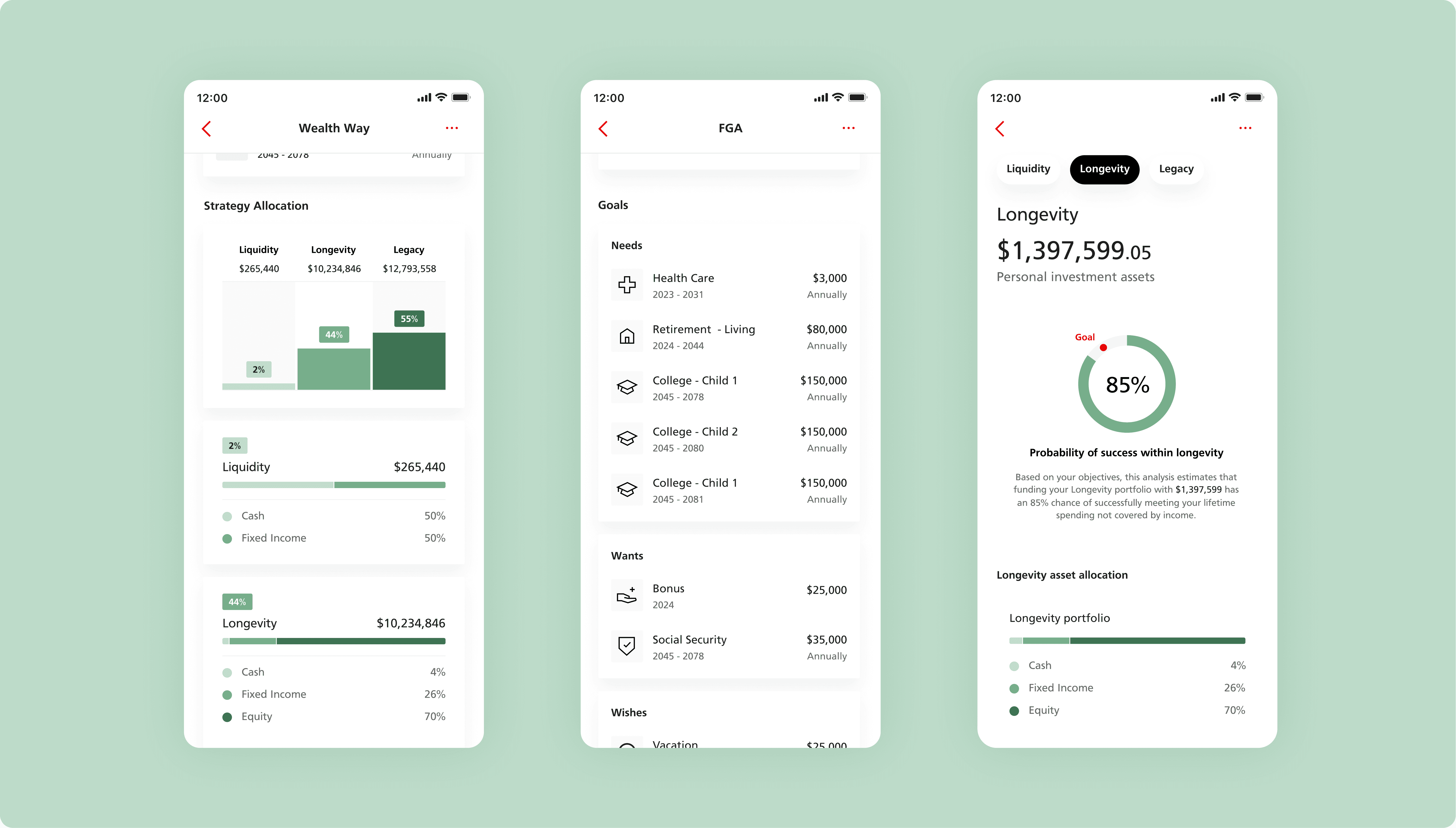
A modern investment experience
UBS' existing in-app investment experience was in need of a refresh. The core focus was to provide UHNWIs with clarity and control. To do this clear metrics and an intuitive navigation were defined - with an updated design language that both reflects UBS' heritage and brings it into the modern day.
Integrating Wealth Plans for the first time
Wealth Plans has until this point only been delivered as PDFs. Integrating them in app transforms this aspect of Wealth Planning from a passive document into in-app drives value for users (engagement, control) and the business (loyalty, insights).
Tailored support and notifications
Support functions and notifications to ensure convenience, security, and transparency by offering real-time assistance and keeping users informed about account activities and updates.
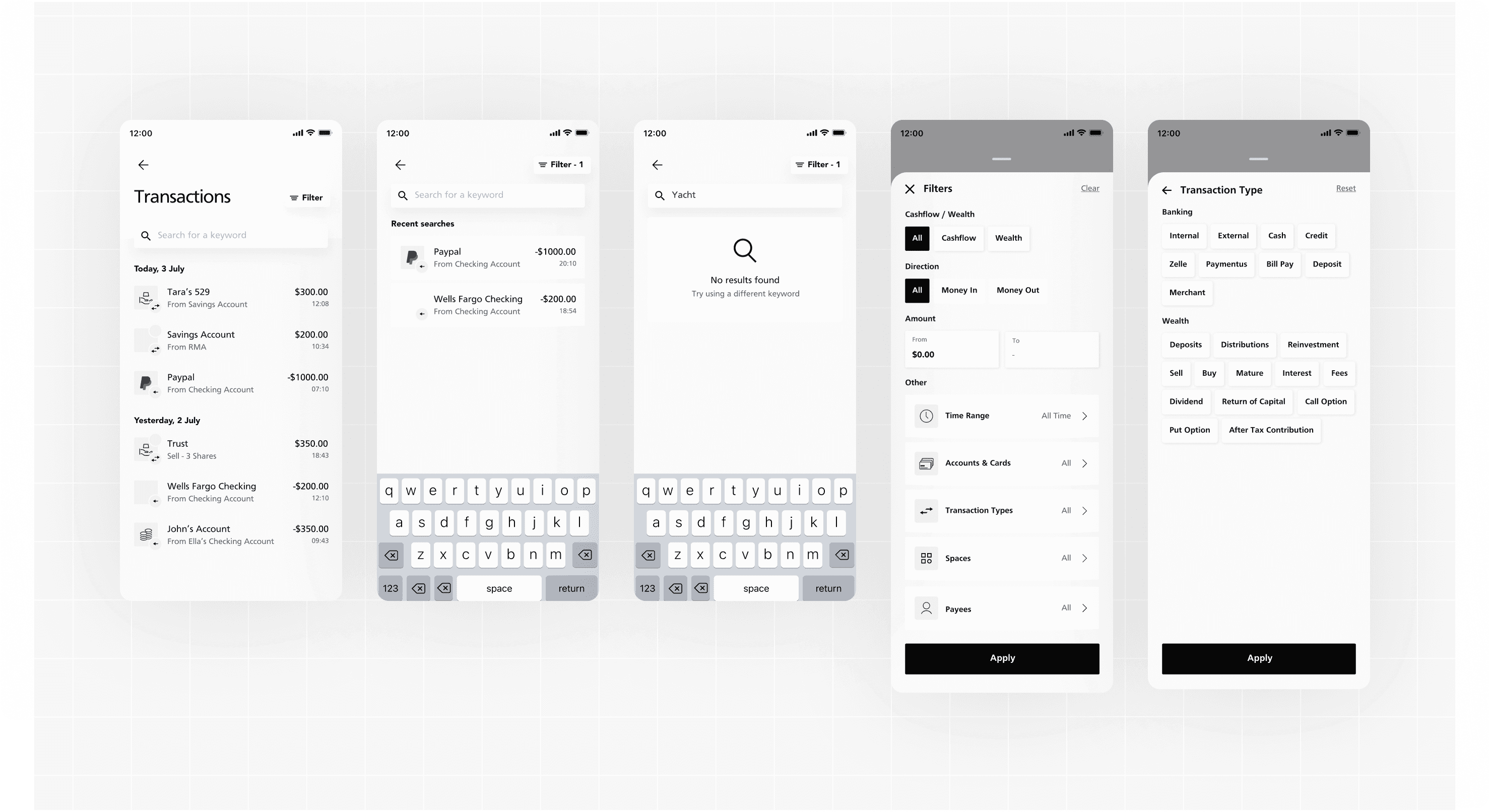
Case study | Filtering
Filtering is a foundational feature, one we are used to seeing in everyday banking apps or investment apps, but what are the implications when these are combined into one experience?
To be able to design for it in this context we had to define:
How does a converged experience change the product requirements and overall filtering experience for the user?
Task definition
To start answering this question I worked with a product manager to map out where ‘activity/transactions’ would be accessible from in app and define which account(s) the user could filter subsequently at each location.
We defined two key points:
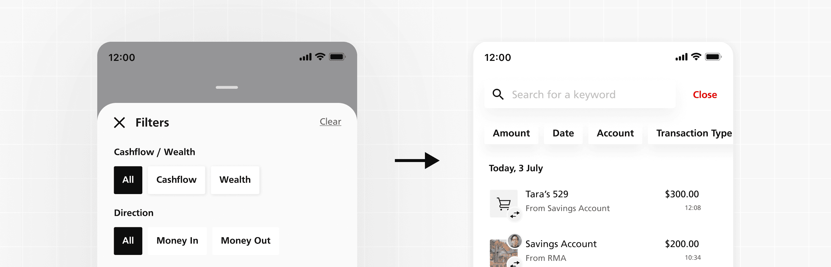
1) You can only filter globally at the dashboard level
2) At lower levels conditional visibility would be used to show relevant filters and accounts within the context of the user flow
This would provide the user with a consistent experience and stop them from getting lost.
User + competitor research
Whilst it was not in scope for us to conduct user interviews solely for filters, I compiled comments from earlier user interviews that would allow us to benchmark against our user bases favourite existing experiences.
"It would have to be as good as or better than
Mint" - UHNWI 👩🦳
As such I looked at existing best in class examples of filtering, such as Revolut, and aggregators, such as Personal Capital and Mint to benchmark against.
Initial explorations + limitations
I used the rules and contextual research from above to start mapping out rough sketches and wireframes. The initial designs relied on a tried and tested design pattern - hub and spoke.
Limited access to client side SMEs at this stage of the project meant that some filter functionality, such as transaction types, were based on best informed assumptions from other experiences.
Pivoting the approach
Working closely with a new product owner from UBS we re-assessed the work done in the previous phase.
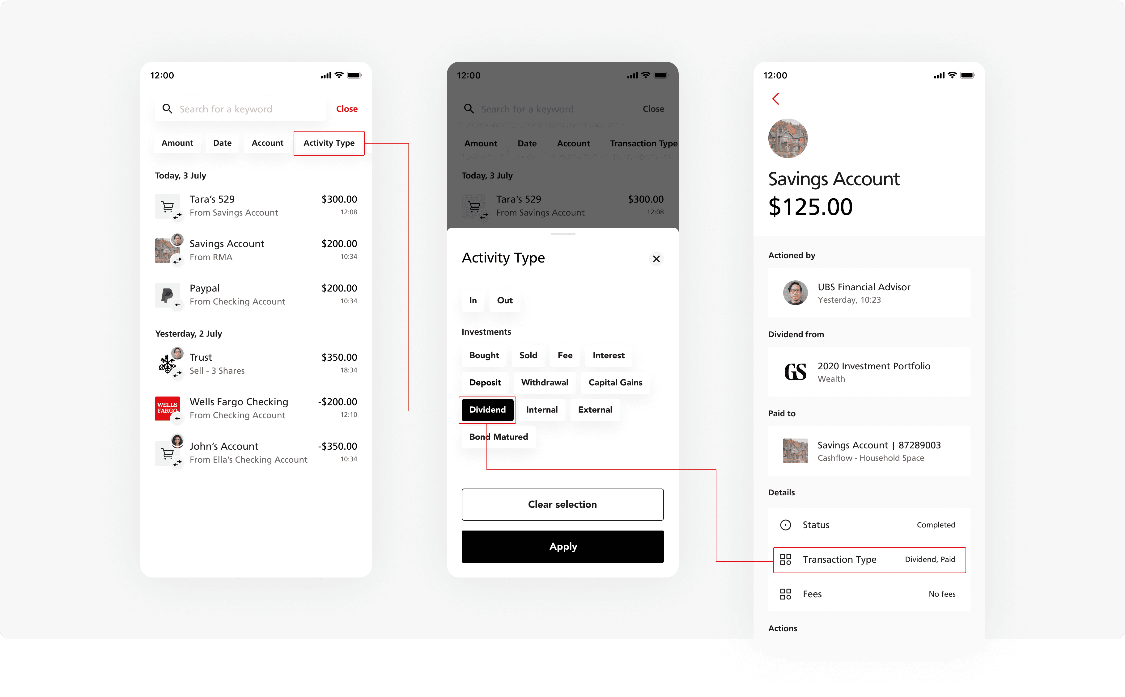
We focussed in on the "pill filters" displayed at the top of the screen (that initially were used to quickly remove applied filters) and decided to explore if rather than a secondary feature it would work as the driving mechanism.
'Pill filtering' functionality defined
The outcome resulted in a filtering experience driven by 'pills'.
The concept allows the user to quickly apply the most prevalent/important filters quickly, using action sheets to display filtering details. The filters can quickly be removed.
The pills are conditional to the entry point within the app.
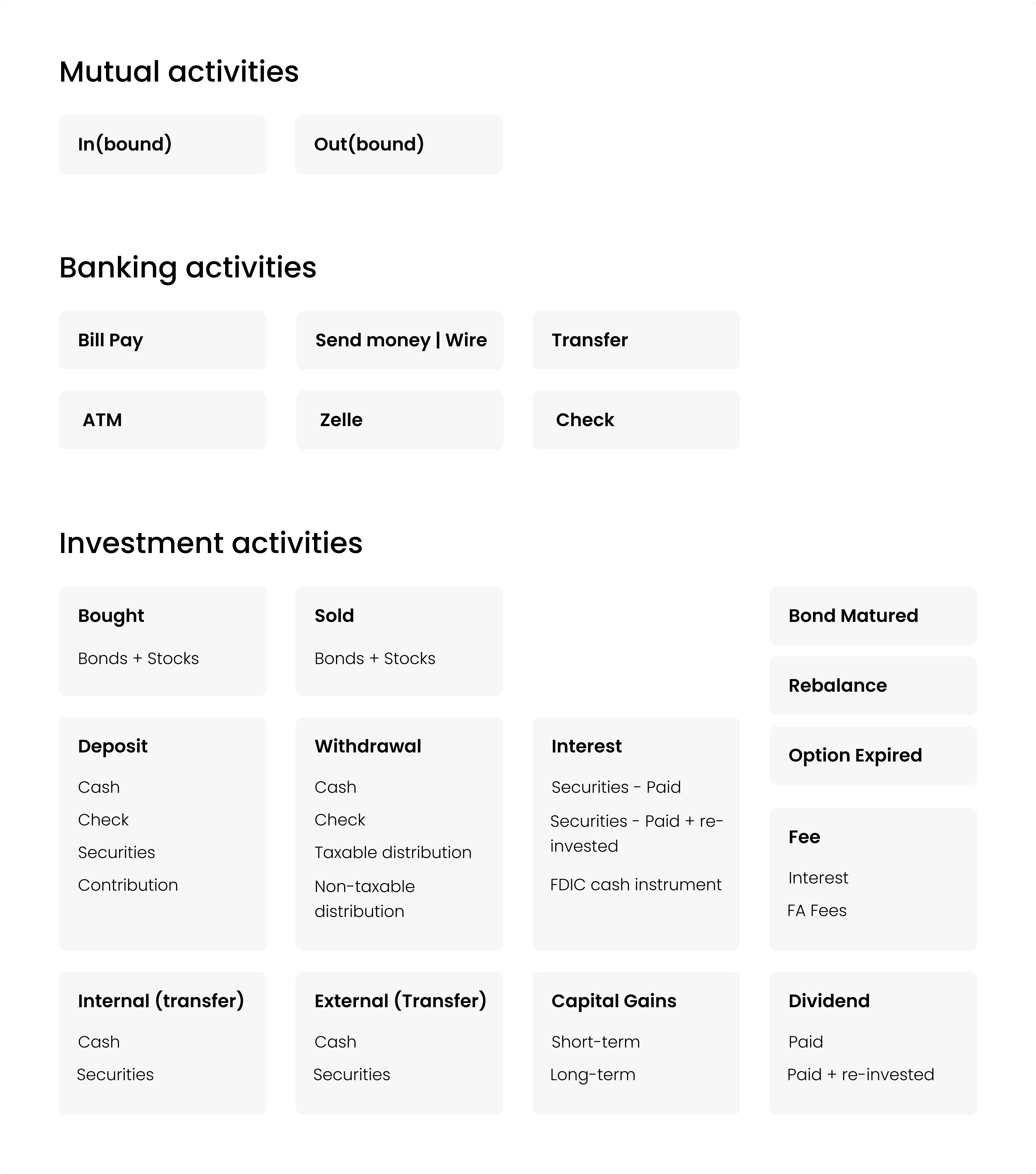
Consolidating the filter 'Activity Type'
Once we had created the framework in which filters would work - 'pill filters' - it was time to delve into the mechanics of the filters themselves.
Working with POs and SMEs we defined there were a possible 40+ transaction or activity types. I mapped these out in order to consolidate them.
My logic was - rather than having a filtering option for 'Cash deposit, Check deposit, securities deposit etc.' these could be logically grouper under 'Deposit'. The granular detail would be shown in the activity cell or activity detail page.
Outcomes
11:FS left the engagement after a third Phase having successfully provided UBS with a validated concept, an updated visual language and streamlined experience for their existing products.
Personally I learnt a great deal, working on a large complex project taught me new stakeholder management skills, improved my presentation ability and improved my knowledge of design patterns for native iOS.
Due to budgets and priority shifts the project I believe was put on hold internally.